Arcitex Website Template
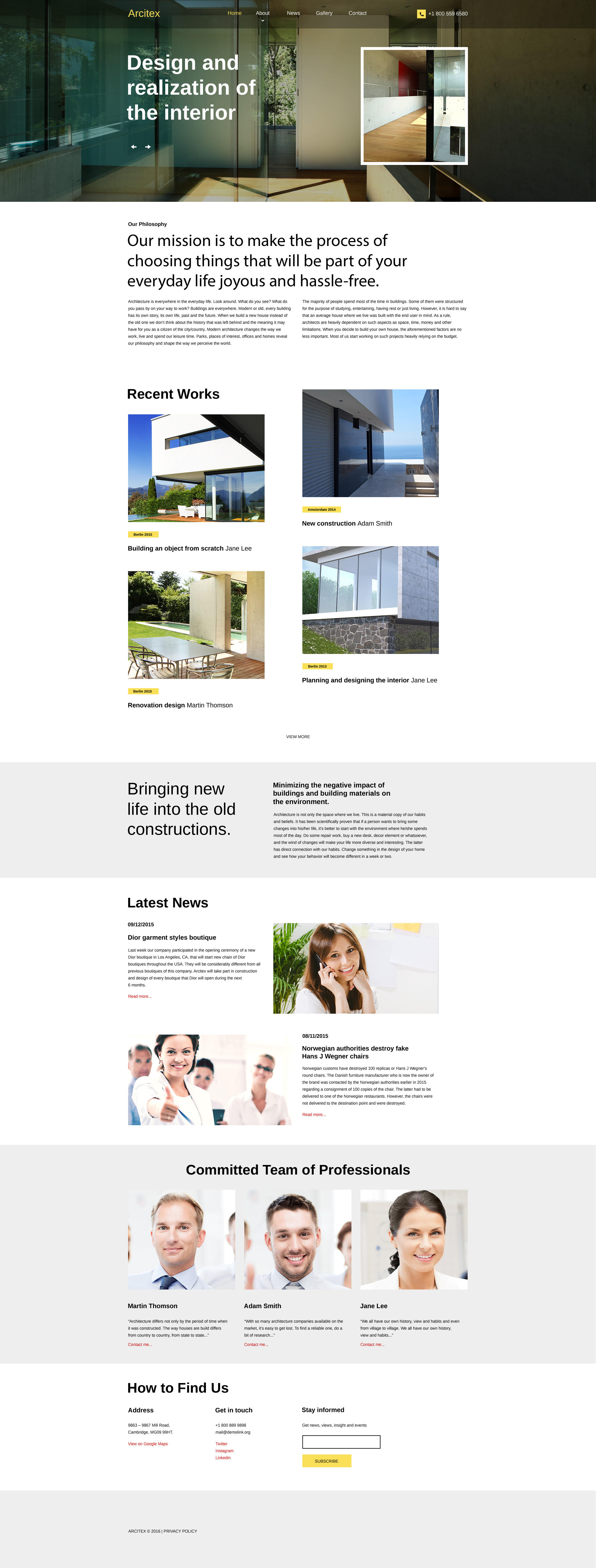
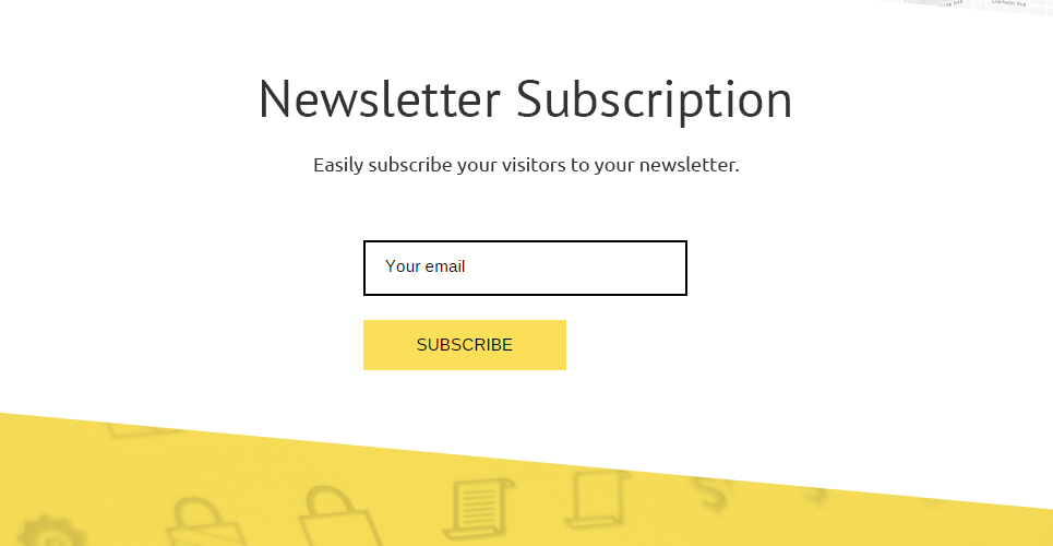
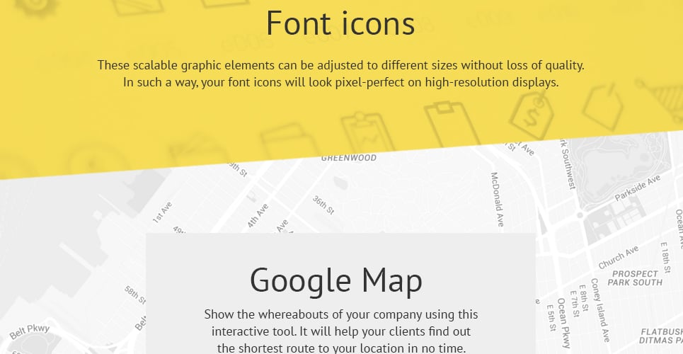
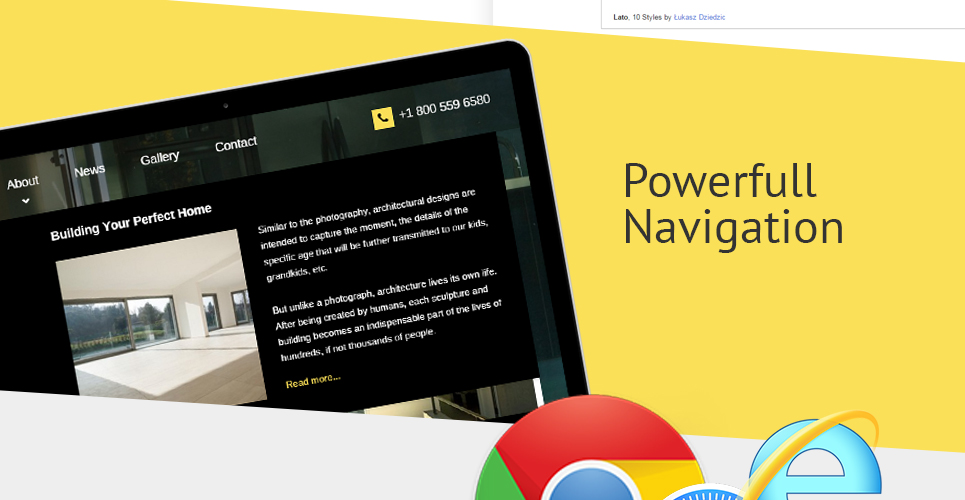
This responsive architecture site template boasts a thought-out design built with CSS3, HTML5, jQuery, and SASS techniques. By means of a top page-wide slider, you can focus prospects' attention on your offerings as soon as they show up on your site. This effective intro area is overlaid with a transparent, slightly subdued bar that features your logo, menu items and contact details. The rest of this grid-based layout is clean and light, which sets a contrast with black typography. It improves content readability and provides an eye-friendly experience. Yellow accents give prominence to call-to-action and navigation buttons and other important elements of the user interface. To keep your audience informed of your news, upcoming events, and promos, there is a built-in newsletter subscription form.
TemplateMonster MarketPlace
TemplateMonster is a marketplace where you as a designer or developer may sell your Web Design Software, Website Templates, Design Elements, Plugins and Extensions. Become a digital products vendor and earn up to 70% from each sale.
This is a Parallax Architecture Firm website template
What is it?
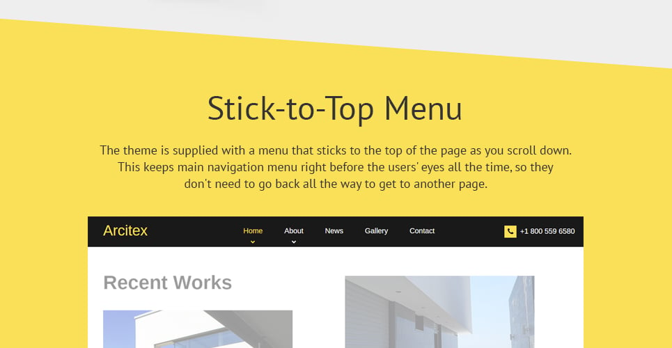
When you travel somewhere, far away objects move around much slower compared to the close ones. Imitation of such an effect on the web business - when the background picture moves slower as opposed to the content and articles, is named parallax. It is used to create a feeling of space in the client's eyes.
Why is it Good?
Parallax help your customers relate with your site and gain much better client experience. It will help you to stand out among your competitors.
Click for more Parallax web templates here
This is Home & Family News website design template with On-line chat functionality
What is it?
The online chat allows you to communicate with your buyers right away.
Why is it Good?
It allows you to live chat with site visitors and analyze guests' web activities.
View latest On-line chat website designs here
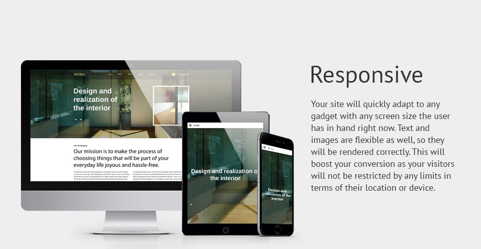
This Home website design template is Responsive
What is it?
Responsive design means well adjusted to the screens of all resolutions on any device.
Why is it Good?
Responsive design is the reason why the website will offer a great browsing experience to all users throughout all gadgets.
Fresh Responsive website design templates here
This template is featured in the following editorial reviews:
| 模板編號: 58280 |
| 類型: HTML 響應式網頁網站模板 |
| 作者: WT |
| 下載: 52 |
| 模板編號: 58280 |
| 模板類型: HTML 響應式網頁網站模板 |
| 作者: WT |
| 下載: 52 |
模板原始碼: .PSD, .HTML,
模板軟件需求: Adobe Photoshop CC+, ZIP unarchiver, Code editor,
信任的元素: Free Support, Stock Photos, Satisfaction Guarantee,
標籤: architectural, architecture, buildings, bureau, clients, company, constructions, custom, design, enterprise, houses, innovation, partners, planning, projects, services, skyscrapers, solutions, strategy, support, team, technology, work,
主題: Architecture, Design, Design & Photography, Home & Family,
模板類型: Neutral, Flat,
顏色: black, white, grey, green,
藝廊圖庫程式: Carousel, CSS and JS, Slider,
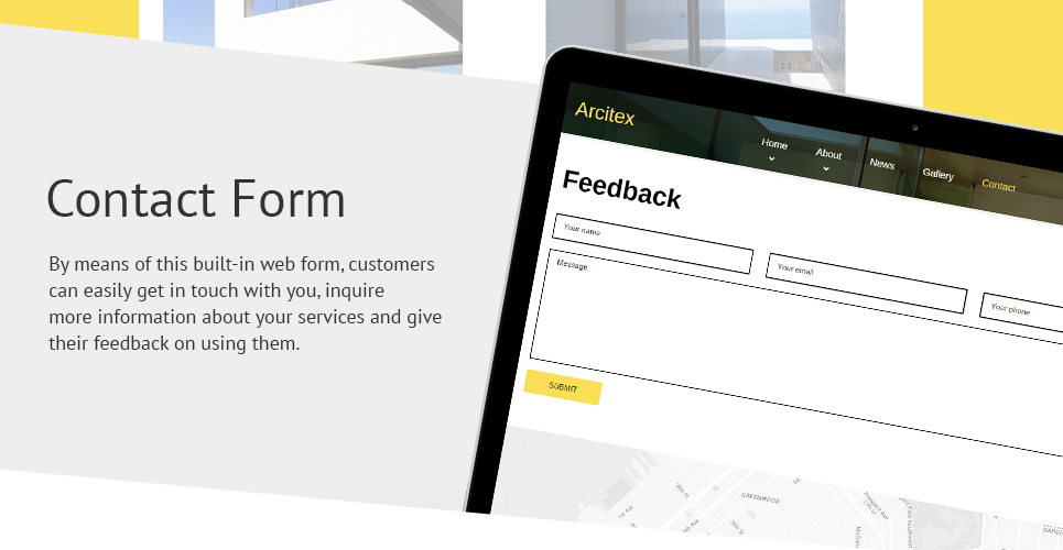
網站表單: Booking Form, Contact Form, Newsletter Subscription,